Archives Posts

The ATL Times

July 23rd, 2010 by Georgios

ec_ajc_web_2.jpg

Here’s another sneak peek into what we have been working on lately. This is a fake news paper that we put together for the rebranding of Epidemik Coalition. If you have been to our other site lately, ECDESIGNCO.com, you might have noticed that it’s under construction. Check back in 2 weeks and see what we have been up to. Promise you won’t be disappointed.

Category: Design, News, Branding Comments: No Comments »

Archives Posts

Logos at Portfolio Center [Week 2]

July 14th, 2010 by Larry

img_0295.jpg

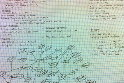
This past week, my students spent a majority of their time doing research on their assigned teams. Some clearly made larger breakthroughs than others. A key to being successful with logo sketches involves narrowing down qualities that you want the logo to communicate. You might want to accentuate the roots of the city and downplay the actual mascot; or vice versa. Does the logo need a basketball or baseball in it? What kind of promotional items do you envision this logo being etched on? All these questions will eventually be answered during this process. Often times, creatives aren’t having fun with the projects and therefore the work suffers. Your quality of work reflects the joy you had in the creative process.

There’s a long way to go, so it’ll be interesting to see how these sketches develop into something concrete.

See more after the jump. Read the rest of this entry »

Category: Design, Branding, Logo Jams Comments: 2 Comments »

Archives Posts

Symbols, Metaphors, & Logos at Portfolio Center [Week 1]

July 7th, 2010 by Larry

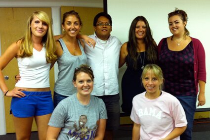
pc_logos_class.jpg
Top Row [Left to Right]: Stephanie, Addie, Dave, Nichole, Alicia. Bottom Row [Left to Right]: Alyssa & Catherine.

It’s the start of another quarter at Portfolio Center and I have another enthusiastic group that I’ll be working with on Tuesday nights. They come from all over and they’ve had a wealth of experiences in their lives that should help their logo creating processes; including drinking drano, collecting 3D cat posters, and busting their asses in front of Michael Jordan.

When I attended PC, I recall my favorite class was a logo class with school president, Hank Richardson. Imagine my surprise and delight when I received a call from him requesting that I bear the torch he’s carried for so long. I said, “Hank, you need to realize that you’re giving the reigns to a crazy person! Who knows what will become of this experiment.” Nevertheless, he’s down with Larry, and he’s going to let me do what I want (within reason).

If you spend any time with me, you’ll realize that I’m a huge sports fan and I’m also obsessed with the aesthetic of sports. I’ve decided to take this obsession a little bit further by having my students work on new primary logos (and possible brand identity systems) for several sports franchises that have terrible logos, or are on the cusp of achieving greatness, but are in desperate need of a re-brand.

Here’s what everyone will be working on, if I remember correctly:
Stephanie - Bakersfield Blaze
Addie - Kansas City Wizards
Dave - Atlanta Thrashers
Nichole - Oklahoma City Thunder
Alicia - Atlanta Apollos (MLS Bid)
Alyssa - New Jersey Nets
Catherine - Charlotte Bobcats

Category: Design, Branding, Logo Jams Comments: 2 Comments »

Archives Posts

ECDesignCo.com Coming Soon!

July 6th, 2010 by Larry

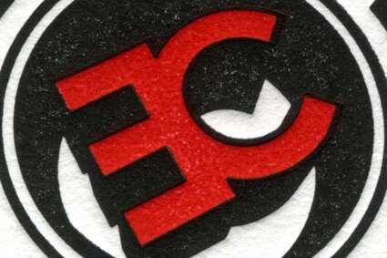
ec_logo_close_up.jpg

A new portal for our design, illustration, photo, & web services is coming soon to ECDesignCo.com or as we like to call it, EC/DC. Stay tuned!

Archives Posts

Logo Jams: Golden State Warriors New Logo

June 17th, 2010 by Larry

golden_state_warriors_new_logo.jpg

The Golden State Warriors have unveiled a new logo for their franchise that reminds everyone of the good ‘ole days of the NBA. The days before David Stern was able to influence everything in the league to benefit his bank accounts. As Jorge Menes would say, “There’s not enough deodorant for that conversation, so let’s move on.”

Coincidentally, this re-brand is taking place right before the NBA Draft. Hmm… I’m not surprised. I’m sure they’ll sell a ton of merchandise now that their logo isn’t a nonceptual blue man.

PROS:
1) Throwback-ish look - I love the reference to the old school San Francisco Warriors’ 1960’s vibe. Apparently the franchise has been selling a lot of “Hardwood Classics” merchandise that features the old school logo, so it’s only prudent that they moved to a throwback look without directly copying it. Often times, I find myself enjoying what is sometimes referred to as a fauxback; reconceptualizations of old jams.

2) Team Colors - A franchise builds heritage by having consistent team colors. The Warriors’ decision to revert to a simpler color palette shows they’re ready to succeed again. Stephen Curry will feel fresh-to-death in his new uniforms. The most recent iteration of the Warriors had orange as one of their colors. What!?!? Why would you do that? Who designed that? Who signed off on that? Orange/Navy Blue/Yellow = Low sales. Sorry, but no one is buying that garbage.

3) New Perspective - I love that they choose to focus on just a section of the iconic Golden Gate Bridge by cropping into it and featuring it from a heroic angle. Everyone already knows what the bridge looks like, so there’s no need to show the whole thing. The bridge is excellently rendered in Illustrator, and you can tell. Props.

CONS:
1) Nudge that shit, bro - It makes absolutely no sense for the blue outline to be inconsistently thin at the top and thicker at the bottom. Someone forgot to use the arrow-up key on their Macbook. Let’s go people! We have tools to align these things! This slight detail (intentional or unintentional) makes me queezy if I stare at the logo for too long.

2) Copperplate. Really? - Out of all the possible typefaces in the world they chose Copperplate?!? I’ve seen this typeface used on everything from a lawyer’s business card to T.I.’s King. Everyone has it and it doesn’t help distinguish one brand from another. This is a PRO BASKETBALL franchise! They should be able to hire someone to create a custom/proprietary typeface. I don’t care if the deadline for this project was less than a day, I would’ve NEVER EVER put this typeface in front of a client. As a designer, you owe it to your client to suggest positive directions and guide them with your reasoning. And if you don’t know type, then you don’t know jack. I can just picture some suit at the Warriors walking in and saying, “My wife typed out a bunch of versions of ‘Golden State Warriors’ on her Compaq Presario and I really like THIS ONE!” while pointing at a sheet of 8.5″ x 11″ computer paper. I’m not a fan of this decision and I look forward to the 2011/2012 season when they revisit this and make an appropriate type tweak.

3) Lil’ Type / Big Type - This is going purely on gut here, but I can’t stand that GOLDEN STATE is so much smaller than WARRIORS. It makes the whole composition very bottom-heavy. Look at the spirit of the 1960’s logo, it’s so lively and optimistic. It directs the eye up and out. The new type treatment makes my eye glaze over the Golden Gate Bridge and focus on WARRIORS; which will probably be situated right around every player’s belly-button. Get ready for weird and off-balanced jerseys. I guess they’re assuming that the logo is “hot enough” and that it will move units regardless of type.

Overall Score:
3halfstars.jpg
I can’t hate too much. They made a strong decision to reference a popular design that has done well in the past and I’m a fan of that decision. Therefore, this logo gets 3.5 stars. If they had paid a little more attention to the details it would’ve easily gotten a 5.

Archives Posts

Dirty South Crunkball Crest

June 16th, 2010 by Larry

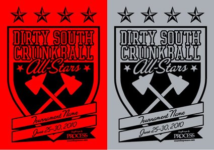
dirty_south_crunkball_crest.jpg

My buddies Adam, Hadi, and Patrick play on a highly-regarded kickball team here in ATL. Over the past few years, they’ve traveled and won 1st place at 4 tournaments. They’re going to Brooklyn this summer to defend their title as the Dirty South Crunkball All-Stars and they asked me (& PROCESS) to not-only sponsor their efforts, but to design a crest for them. This will be featured on their uniforms (screen-printed tees) in some fashion that’s yet to be determined.

These days, many international football teams now feature their opponent or a date of a special match on the actual uniforms (kits). I’m not 100% sure who this trend is attributed to but I think it’s England who brought it back recently with the introduction of their amazing Umbro kits in 2009. Anyway, I wanted to follow-suit and allow for the Dirty South Crunkball squadron to customize the banner on their crest to allow for special mentions on the crests of their tournament uniforms.

Do y’all like it? If there are any extras, we’ll throw them up for sale in the PROCESS Online Boutique.

Category: Design, Tees, ATL Life, Branding Comments: 1 Comment »

Archives Posts

A Branding Project…

June 16th, 2010 by Larry

gy_branding.jpg

Recently, Georgios and I have been working on a small branding project with our good friends at Graveyard Tavern. Here’s a small teaser of what to expect from our team later this year.

Category: Design, Branding, Teaser Comments: No Comments »

Archives Posts

LaDiDa for iPhone

November 16th, 2009 by Larry

ladida_web_shots_425.jpg

I recently worked with emerging iPhone app developer, Khu.sh, on the branding and interface for their company and it’s new product, LaDida - a reverse karaoke app. You sing, and it makes up the music to accompany your voice. You can choose a genre of music and a tempo for each tune you sing. One of the greatest features of the app is that it allows you to share your tunes on social-networking sites such as facebook and twitter. Future updates will include more music genres and perhaps auto-tune.

This was my first time to work on anything for iPhone, but I found the experience very enjoyable and similar to web design, except you’re dealing with a much smaller canvas.

Download: LaDiDa.

Archives Posts

Blü Magazine Issue 8

October 19th, 2009 by Larry

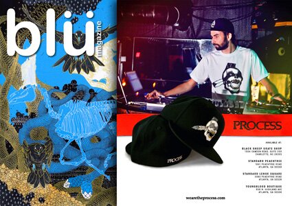
Check out our ad in the newest issue of Charlotte/Atlanta/Charleston-based periodical, Blü Magazine. It’s available now at fine retailers around town, such as Standard and Youngblood.

We used this photo of Cristo Disco because he always holds it down for us at El Bar in Atlanta. Thanks to him, and Ross Martin for the shot!

Category: ATL Life, Branding, Charlotte Comments: No Comments »

Archives Posts

Audible Recording Boutique Logo

August 27th, 2009 by Georgios

logo_white.jpg

Lately, I’ve been working with Audible Recording Boutique, formally known as Dirty South Productions, to change their identity to something more modern and fresh. They came to us needing a new look for their brand that spoke to not only hip hop artist but to an array of artists. There’s more to come for Audible so stay tuned.

Category: Design, Branding, Our Portfolio Comments: 2 Comments »

Archives Posts

Logos Updated!

August 25th, 2009 by Larry

logos_logotypes_header.jpg

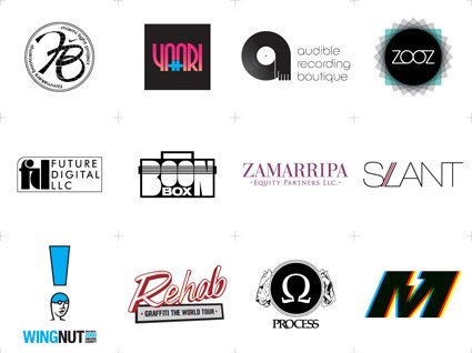
Head over to our Portfolio and check out some of the recent logos we’ve completed. This update has been a long time coming…

Archives Posts

EC Sticker Sighting

August 17th, 2009 by Larry

ec_moon.jpg

Kevin Perry sent in this photo from the Plaza Theatre on Ponce de Leon here in ATL. The upper-left corner of this movie poster for, Moon, is bearing an EC sticker from over 2 years ago. I haven’t seen one of these around town in a long time.

Alright, the next person to us a photo of an EC sticker that’s still living somewhere in town wins a PROCESS prize pack!

Category: Stickers, Graffiti, Branding Comments: 1 Comment »

Archives Posts

Name Tomahawk Girl / Win PROCESS Gear

July 13th, 2009 by Larry

name_tomahawk_girl_425.jpg

We intentionally gave our Tomahawk Girl graphic a generic name because we want our crew/readers/fans to come up with a name for her. The direction of the brand is ultimately dictated by you. So, come up with something clever and email your ideas to and we’ll choose a winner on Monday the 20th of July.

Not only will the winner receive creative bragging rights, but they’ll also win 3 Process tees (including the newly-named Tomahawk Girl tee), a cap, stickers, and additional goodies.

EC blog readers: Leaving a comment on this blog post counts as a submission as well. Happy naming!

Category: Tees, Process, Branding, Flyers, Contest Comments: 8 Comments »

Archives Posts

Eugene Kan of Hypebeast

June 29th, 2009 by Larry

eugene_kan.jpg

A few weeks back, I spent some time in Hong Kong made a point to “look-under-the-hood” of the inner workings of Hypebeast as I spent the afternoon with Managing Editor, Eugene Kan. This was a great chance to put a face to a name on someone I’ve only had contact through the internet and also an opportunity to “take things in” as a curious contributor to the EC/PROCESS brands. We spent the afternoon discussing the current state of streetwear and the global economy’s effect on all of us as consumers. Eugene also agreed to this exclusive interview with me based on our conversations of that day.

Check it out after the jump.

Read the rest of this entry »

Archives Posts

M.L.P. / Nike Filmmakers Bootcamp Logo

May 28th, 2009 by Larry

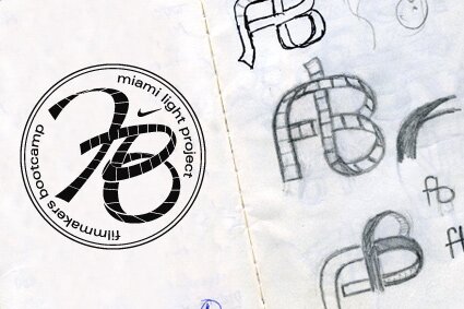
I wanted to show the process behind a recently completed a logo I did for Miami Light Project / Nike Filmmakers Bootcamp. It’s a 4 week summer camp where Miami youth get to learn vital skills necessary to filmmaking. I wanted to illustrate a continuous strip of film spelling out the initials for Filmmakers Bootcamp, while incorporating equal parts of both sponsor identities. I did this by incorporating Miami Light Project’s logotype (completely spelled out) and placing a simple Swoosh in the top right hand corner of the mark. It wasn’t necessary to write “Nike” as well, as we are all aware of the equity already associated with the Swoosh.

More sketches after the jump Read the rest of this entry »

Archives Posts

Workin’ on the Weekend [EC for Megan Huntz]

May 25th, 2009 by Larry

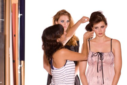
Despite it being Memorial Day Weekend, the scene at our studio was bustling with life on Saturday. EC resident photographer, Jorge Menes, was working on set for client, Megan Huntz Dresses. Jorge has worked with Megan on her lookbooks since the beginning of her line several years back. The shots always take my breath away, and I have no doubt that they’ll do the same this time around.

Keep an eye out for a post from Jorge in the coming weeks as he turns the imagery from this weekend into finished lookbook-worthy shots. If we’re lucky, he’ll walk us through the “process”.

Check out a few more behind-the-scenes photos by yours truly after the jump.
Read the rest of this entry »

Archives Posts

Atlanta Hawks Alternate Uniforms???

May 3rd, 2009 by Larry

atlanta_hawks_alternate_jersey_2009.jpg
Does anyone know someone that works at Atlanta Spirit?

Firstly, Congrats to the Atlanta Hawks for their first playoff series victory in 10 years! It’s been amazing to watch the process of transforming the worst team in the league to one of the most exciting teams to watch.

While I was poking around on some sports uniform/logo blogs earlier today (yes, I totally nerd-out on sports aesthetics) it dawned on me how the late 2007 rebrand of the Atlanta Hawks didn’t include an alternate uniform. Also, they eliminated using Yellow (which had been a team color since ‘72), downplayed the use of Red, and introduced Navy Blue and Silver as team colors. Currently, they wear predominantly White uniforms at home and Navy Blue uniforms on the road. I’ve included a Hawks uniform timeline PDF here.

Since there is no current Hawks alternate uniform, I quickly comped an idea onto a Josh Smith photo from their 2007-2008 campaign; using Red as the predominant color and the ATL city abbreviation. I’m not sure if there is a possibility for Hawks management to introduce a new alternate uniform for next season, but now would be a great time in Hawks history to do so. ATL pride is high, David Stern could make more money, and I’d definitely spend my hard earned cheese on a Red-Alternate Zaza Pachulia jersey!

Category: Design, Misc., ATL Life, Branding Comments: 9 Comments »

Archives Posts

Quintin - Originators of the 5 Panel Fitted

April 19th, 2009 by Larry

quintin_5panel_back.jpg

Yesterday, a special package came in the mail from Quintin, a new hat company owned by some of our friends on the west coast. What sets them apart from the norm is that they specialize in fitted 5 panel caps, thus eliminating the need for a pesky adjustable strap and delivering some class to the 5 panel category. Their first wave of releases will take place on May 2nd, kicking off a summer of weekly releases bearing collaborations with many heavy-hitting design teams (the line sheet looks amazing). We’re honored to be included in this succession of releases and are currently tweaking the final details on the first PROCESS x Quintin collaboration set for later this summer. Read the rest of this entry »

Archives Posts

Epidemik Coalition / PROCESS on Vimby.com

April 6th, 2009 by Larry


Our feature on Vimby.com just went live! Thanks to Chandler K. for spending the day with us and producing this great piece. Don’t forget to give us a rating!

Archives Posts

Yaari.com Goes Live

March 26th, 2009 by Larry

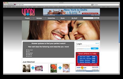
yaari_live.jpg

A while back, I mentioned this project as we had just completed designing the mark for Yaari.com’s rebrand. Since this project was deeply a social-networking site with lots of bulk, EC was challenged with making hierarchical decisions on content as well as coding the CSS for the newly relaunched Yaari.com. After handing over our comps, we’ve been anxious to see the results over the past few months. It’s great to see our work come to life. That’ll never get old.

There are a few new websites we’ve recently completed that are about to launch very soon. Stay tuned for updates!

« Previous Entries